Suitable Technologies builds Remote Telepresence devices called “Beams”. Think of Beams as “Skype on wheels”…devices with audio and video that allows a user (pilot) to remotely maneuver a space. The Beam software suite started development well before I came on board, and it grew over the years. Desktop, mobile and eventually web platforms, with a downloadable Piloting app, and a web-based Administration application.
The very basic, very blue Beam software experience
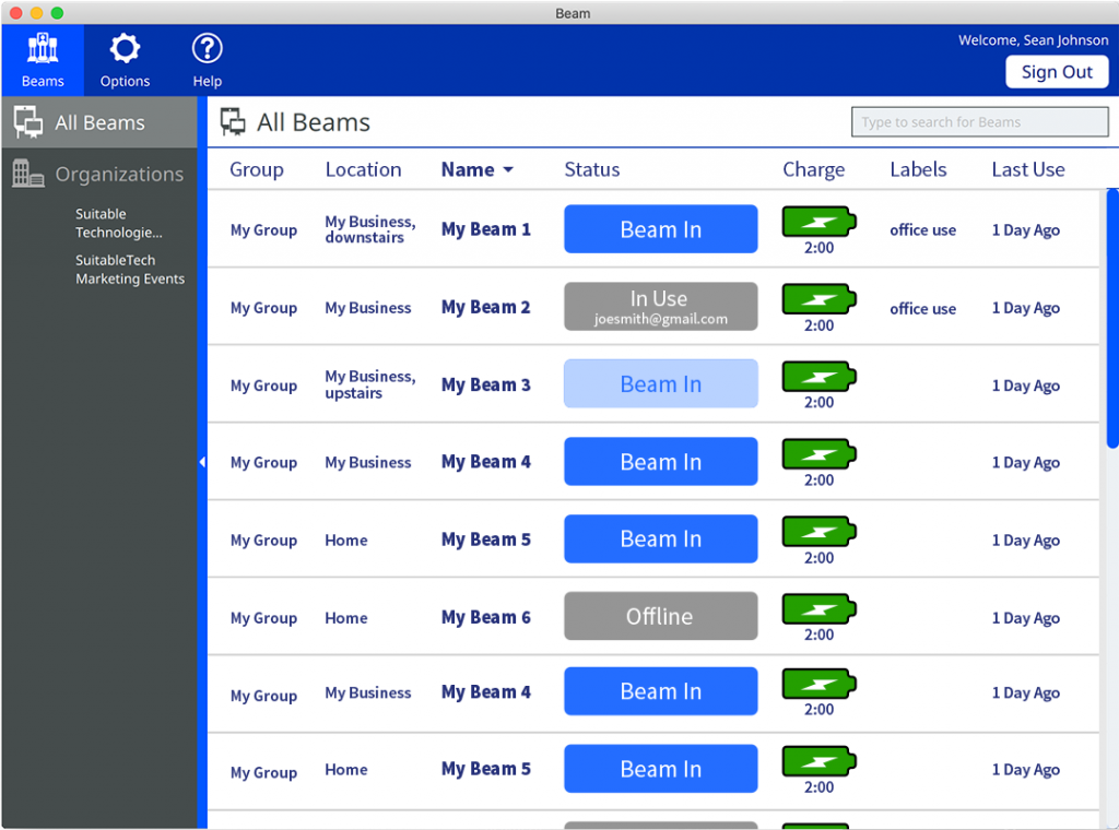
The existing Beam list, or "Lobby" where you choose a device to "Beam" into.
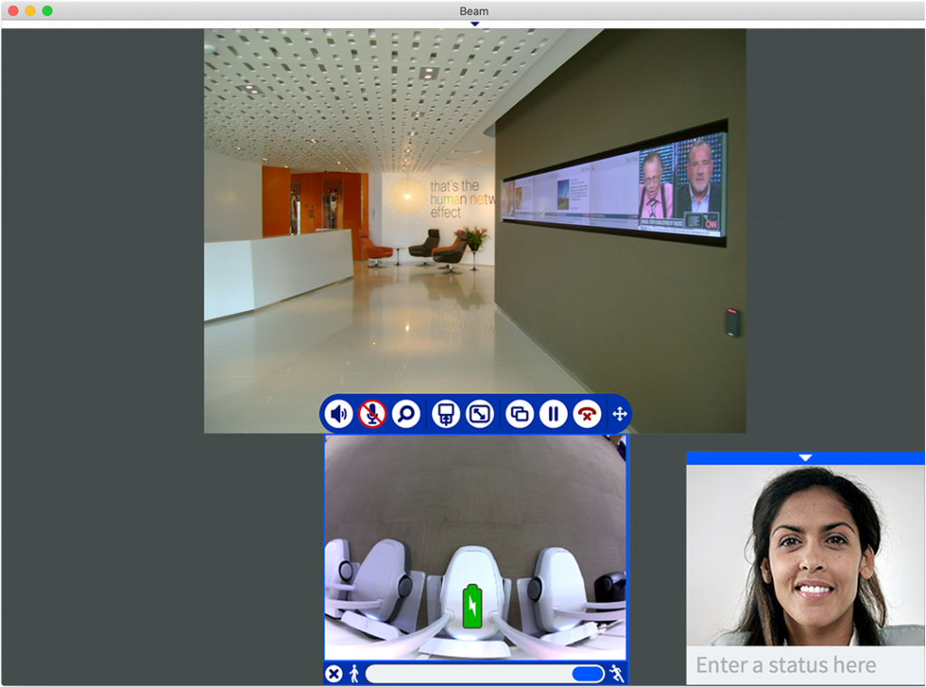
The Pilot interface. Drive around and talk!
Problems
• Supporting and enhancing each of those apps, across platforms and form factors, took effort and staff. Separate teams were needed to build and maintain the QT-based pilot app and the web admin, along with specialists to address Android and IOS issues. (see "Our Software Ecosystem" below)
• The experience of the pilot application was widely different from the Admin application. That would seem to make sense, except 90% of the users used only 10% of the functionality of the admin app, so it would be nice if they didn’t have to plow through a complicated web application just to invite a work colleague to use their Beam.
• The pilot application was built under some poor assumptions, and using some proprietary and/or rapidly sunsetting technologies. So by 2016 it definitely needed to be scrapped and rebuilt.
• Lastly, our company’s branding had changed and there was a push to rebrand the software...another great reason to retire the “very blue” interface.
Secondary Problem
Beam is a hardware platform with minimal margins. This would be fine if there was another source of revenue: like the "minimal gain on the razor for high margins on the blades" model. Or ... take a loss on the hardware box, because you’ll make your money on the content. So for Beam to be a long-term successful endeavor, we either needed to raise the price on the hardware, or find a way for people to make money on the use of Beams.
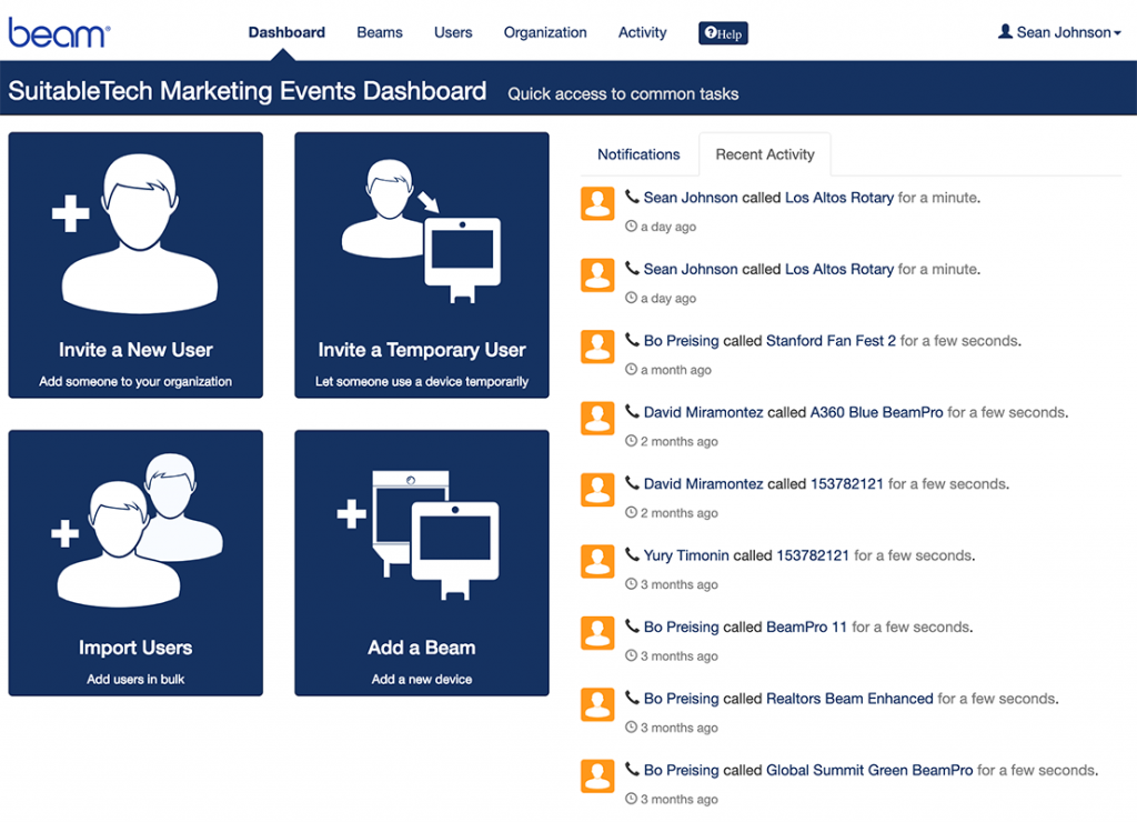
The Administrative application. Not bad, but a completely different experience (and a completely different set of blues?)
Our Software Ecosystem
Desktop Pilot Application
Mobile Pilot Application
Chrome Application
In-development Web client
Web Admin Application
Mobile Admin Application
"Simple" Web Admin Application
MAIN application used by everyone
Mobile port of the previous, used sometimes
Used by a handful of Linux people
A single, unified experience. The future
Fleet Management for admins
Fleet management on-the-go
Simplified Management. Rarely used
Experience 1
Experience 2
Experience 3
Experience 4
Codebase 1
Codebase 2
Codebase 3
Challenge
How could we create a new experience that combined enhanced piloting with basic admin features? Could it be a single, unified experience? That works well on every form factor? And that novice users could find intuitive while expert admins find useful?
Most important, is there a revenue-model we are ignoring that can bolster the hardware platform? Shouldn’t we be finding reasons for people to purchase Beams already?
Ideation
From the beginning I thought telepresence devices could do more than just save companies on their travel expenses (not that that isn't a valid reason to purchase one, of course). I thought they could inhabit places of need and solve or at least alleviate problems. Beam had the occasional press where an infirmed child used a Beam to attend class. In fact, one of my software engineer colleagues donated a Beam to their son's school for just such a purpose: so a classmate could still attend class despite her immunity issues from chemotherapy. As you can imagine, these were the stories that really inspired me.
I wanted to push Beam away from being solely a hardware device, and more toward being a service or experience platform. We had a sales manager whose sole purview was selling Beams to museums, and I pushed to have sales people dedicated to other places like schools, hospitals and landmarks. I figured if we entered a revenue-share arrangement with places like museums, landmarks, and malls, and built the system up with for-profit "Beam visits", then we could offer them to hospitals and schools at greatly-reduced prices where people could use them for free.
These Beams are great! Do I have to buy one to use them?
– Customer Comment during Tradeshow Presentation, 2015
Research
I wasn't successful selling most of my colleagues on the idea of this new revenue model, so there was no real stakeholder research to be done. I would have to convince them with a striking design and prototype. This project just got skunkworks!
Competitive Analysis
Doing a Competitive Analysis wasn't very fruitful either. I analyzed the software of several of our competitors, and to my mind they had their own usability issues. Most were doing similar things...just connect people to their devices and get out of the way. And none had any type of "rental experience".
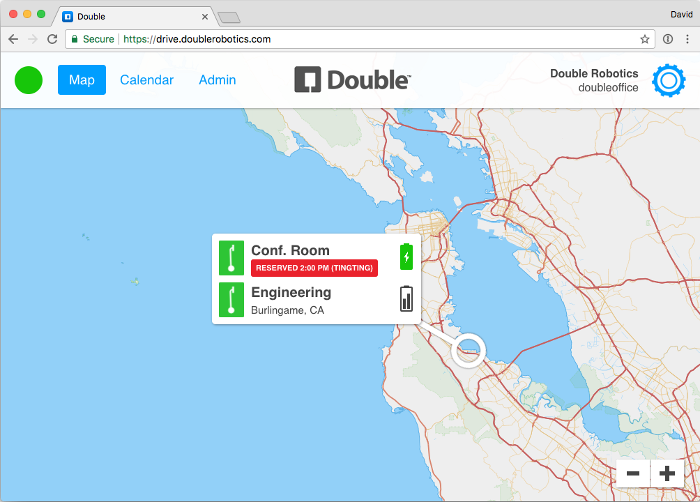
Competitor Double Robotics focused on a map-based UI to select devices
In the early days of this redesign, Double had no enterprise-level features. Just recently they added Fleet Management.
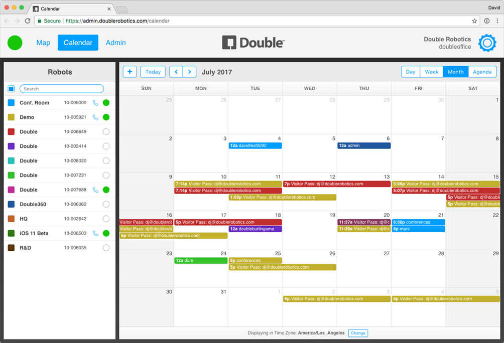
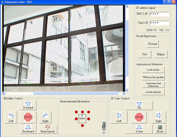
Some of our competitors UIs weren't very helpful
Not entirely sure what's going on in either of these UIs
User/Customer Research
Coming soon
Conceptual Frameworks
Some Things Had to Change
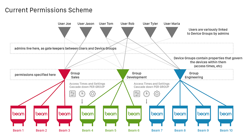
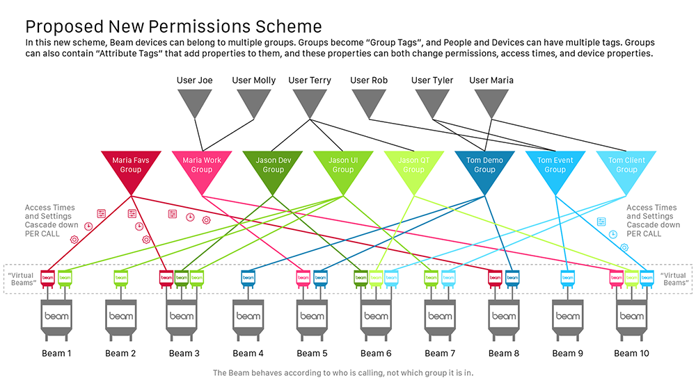
The existing device permission scheme would never support a robust ecosystem like we'd need. Each device could only be in a single group at any one time. And we used groups to assign properties like access time to the devices. Customers had chronic problems moving devices between groups to assign different access or setups, cutting off old users from that device in the process. It was clunky and simplistic, and would never support large numbers of customer-users using devices as "virtual tourists".
The base application would need to expand and standardize
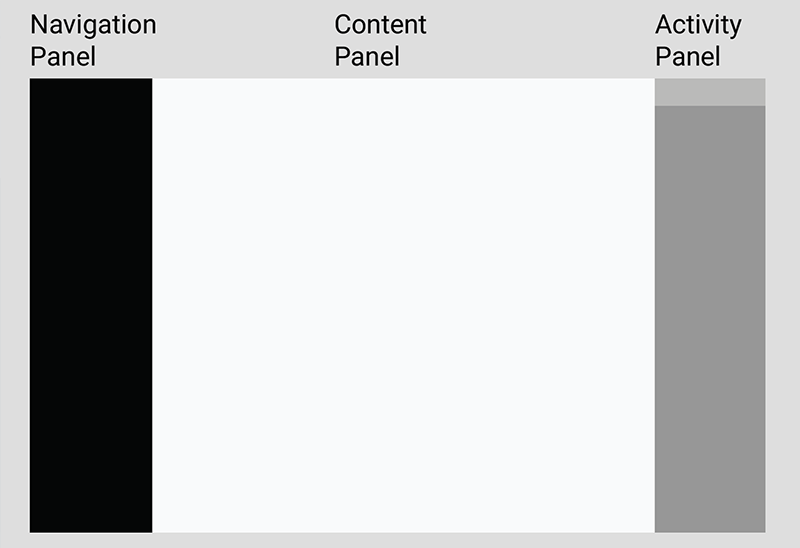
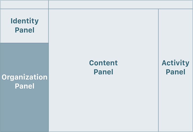
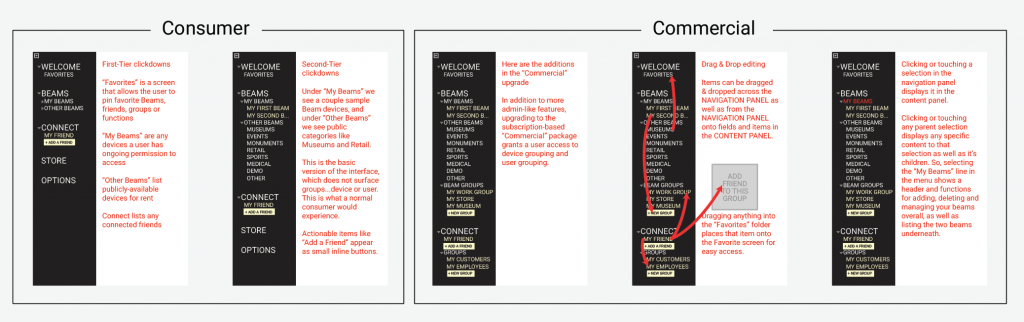
We would need to expand the navigation to accomodate new access points. And instead of non-standard left-column org icons, we should move to a more pattern-friendly navigation metaphor. This all meant slicing-up the interface more consistently and standardly. So...nav left, content right, status top.
Much Navigation exploration ensued...
We would need to expand the navigation to accomodate new access points. And instead of non-standard left-column org icons, we should move to a more pattern-friendly navigation metaphor. This all meant slicing-up the interface more consistently and standardly. So...nav left, content right, status top.
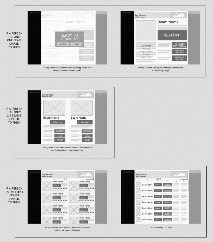
And let's think about how to present the content...one device or many
Shouldn't this software be smart and anticipate things for the user? I wanted similar but different experiences depending on your number of linked devices, time pilotting devices, experience, etc.
Finished Mockups
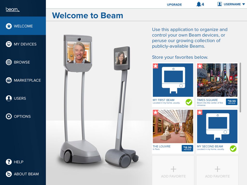
Initial Mockups for a new Home screen. Improvements include a cleaner UI, an area to collect favorite devices, and a friendlier onboarding experience, aimed at drawing in new users
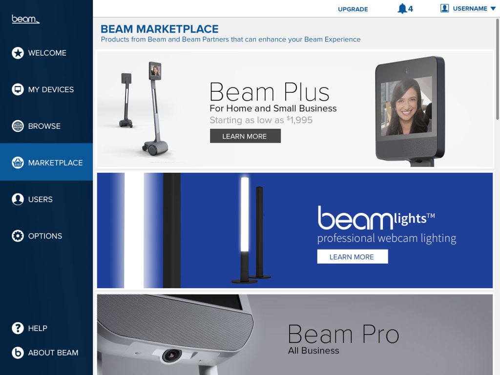
The new Marketplace screen where people can buy products directly
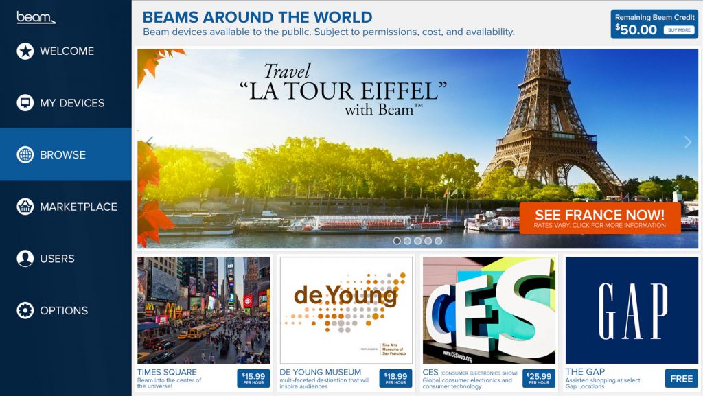
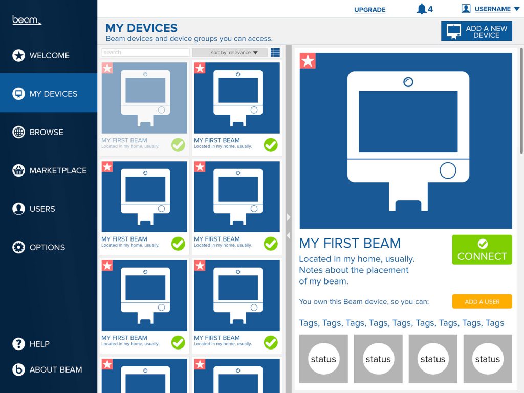
This screen largely replaces the old Beam Lobby. Improvements include new views (map view, card view, etc) and device details inline
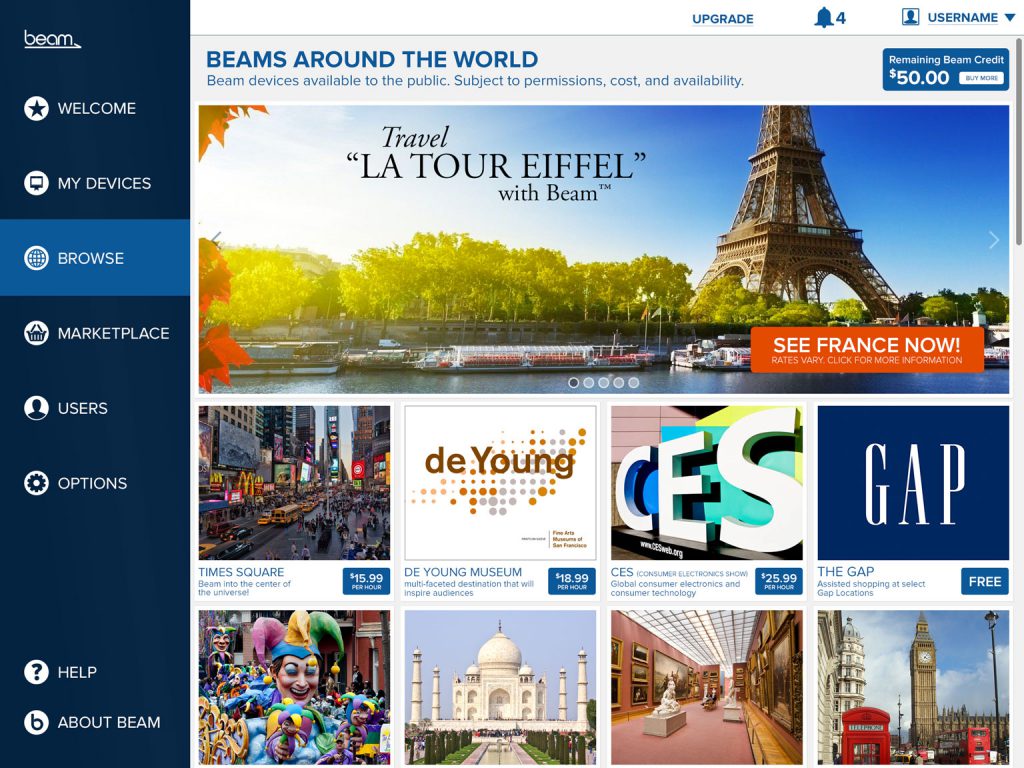
This "browse" screen is the heart of the redesign. It allows landmarks and retailers to create Beam "shops" that allow any vetted and qualified users to rent Beam time. Museums, retailers, landmarks, tradeshows, and even schools and hospitals can join the Beam ecosystem. And of course SuitableTech gets a cut of the revenue too.