Case Study

The Amber Engine PIM

Overview

Hired in March 2020 to design a next-gen SaaS Product Information Management (PIM) experience.

Create a more compelling, user-centered experience than the previous PIM (Vesper PIM).

Roadmap and Iterate to become a market-leading PXM (Product Experience Management Platform).

Problem

Amber Engine had already designed and built a PIM years before, and they had onboarded a handful of customers, but the overall experience was not good, and using it required constant in-house Customer Success maintenance. Stakeholders wanted to start from scratch in the hopes of designing a progressive market leader.

Target

Amber Engine was founded within the Interior Design / Home Furnishings space, so the three software products they had created prior to my involvement existed in that space. Even though PIMs tend to be product agnostic, our sales targets were home furnishings, and any design decisions would be related.

Team

  • Product Director
  • Design Director (Me)
  • UX Design Consultants
  • Customer Success team
  • Development Director
  • Developers

My Role

I was brought in as a Senior UX Designer and promoted to Design Director within 9 months. I managed the UX/UI design of the entire product, including an off-site team of UX Designers.

OK so... what is a PIM?

Product Information Management (PIM) software is a type of SaaS tool that centralizes a brand’s product information. It gathers data from various sources like spreadsheets, shared files, and ERPs.

Once this data is imported, the software helps you optimize and refine it using advanced tools and bulk editing. After refining, you can easily distribute the product data to different endpoints in the required format.

The advantage of PIM is the simplicity and repeatability of this distribution process. Once set up, sharing your data multiple times becomes straightforward – it’s not a one-time complex task, but a swift, repeatable translation.

 The Problems a PIM solves

Imagine you are a brand, making and selling coffee tables, side tables, and end tables online across multiple marketplaces. You might have an ecomm manager for each marketplace you sell on… Amazon, Wayfair, and Overstock. They spend their days managing stock, updating pricing, managing shipping issues and returns, and handling sales and promotions. Things change often. It’s complicated, but you are managing.

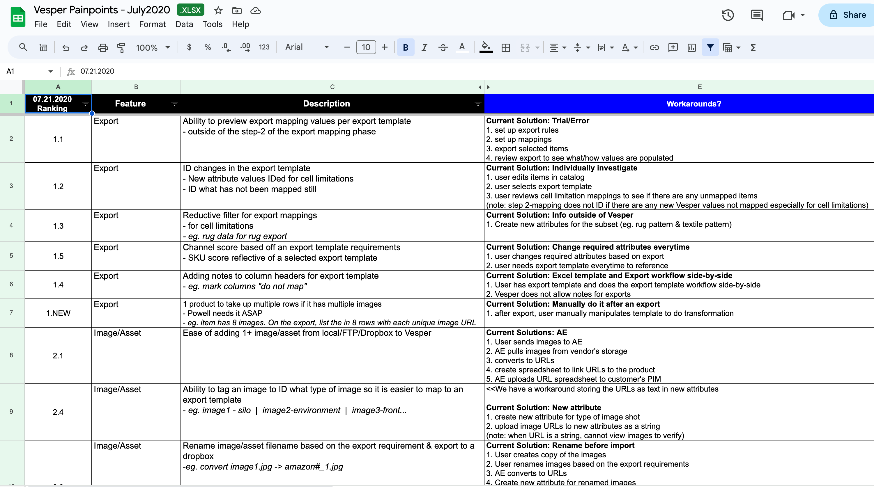
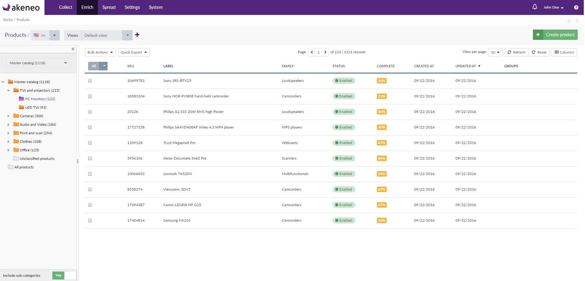
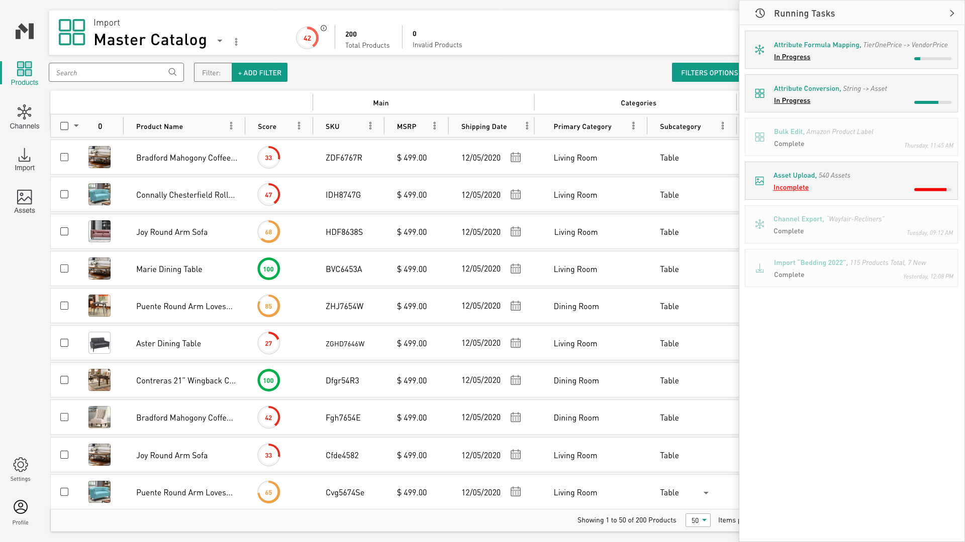
For now, these people spend all their time in Excel spreadsheets, but the problem is keeping track of all this. An Excel sheet for each product category… and for each endpoint… means 9 spreadsheets (3 endpoints x 3 types of products). Of course, this is assuming the most efficient methodology, because they might also create new spreadsheets for promotions or annual sales. The problem grows. But at it’s most basic, it is 9 Excel sheets that need to stay consistent and up-to-date.

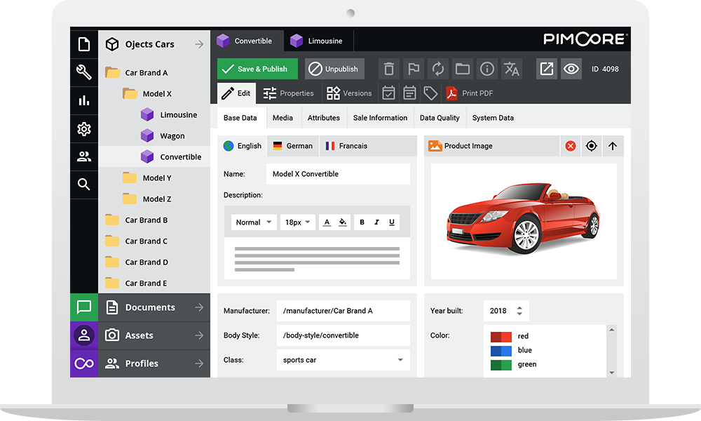
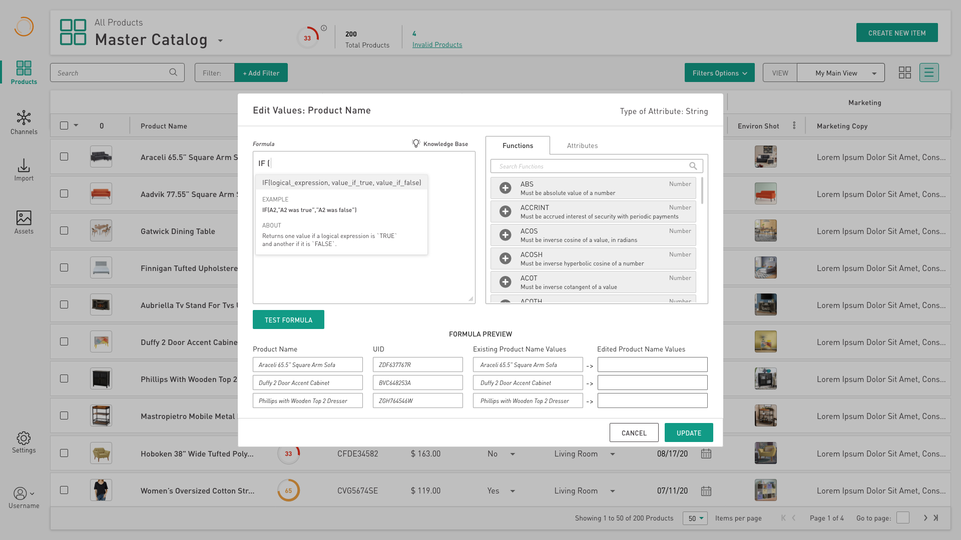
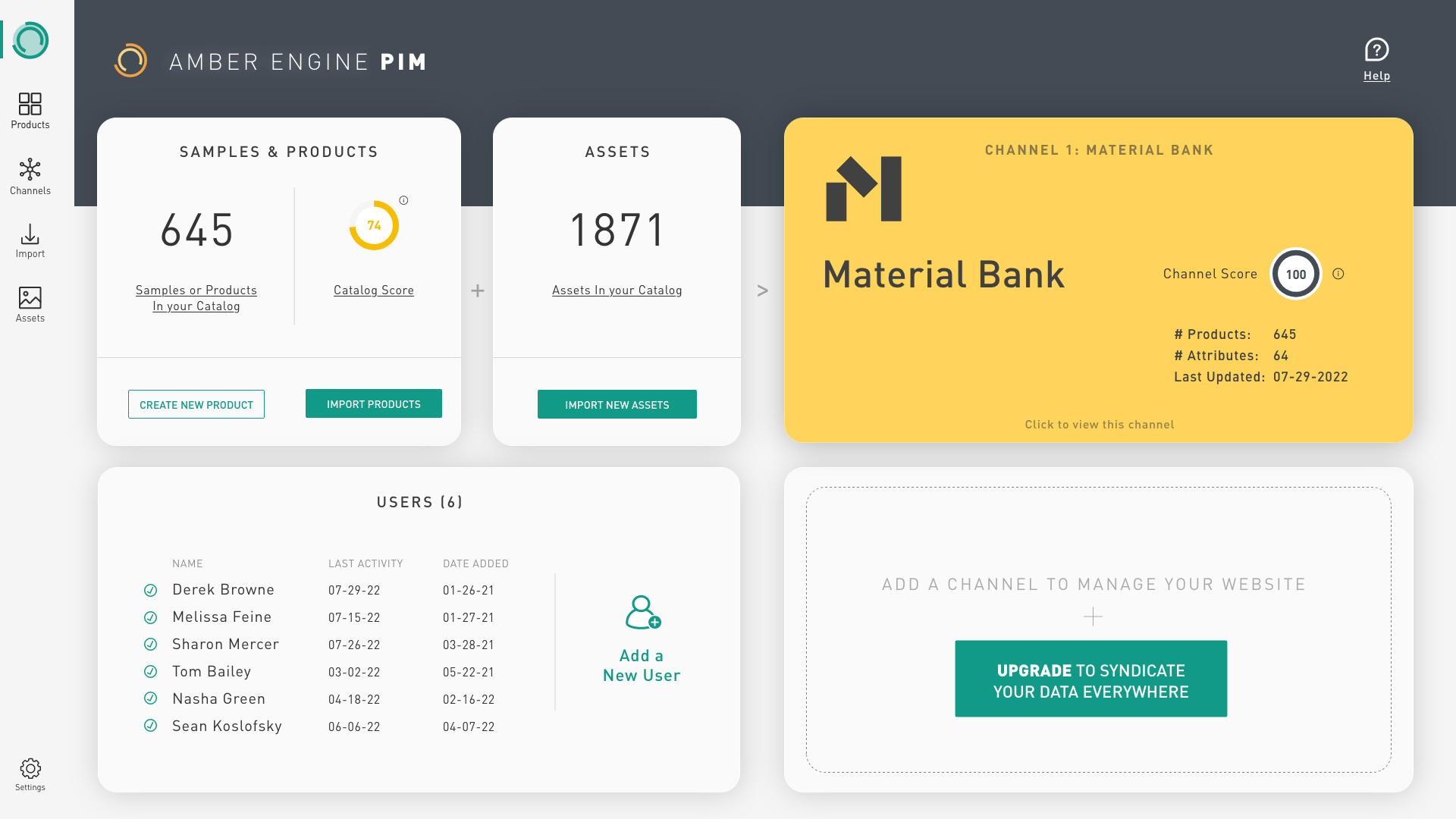
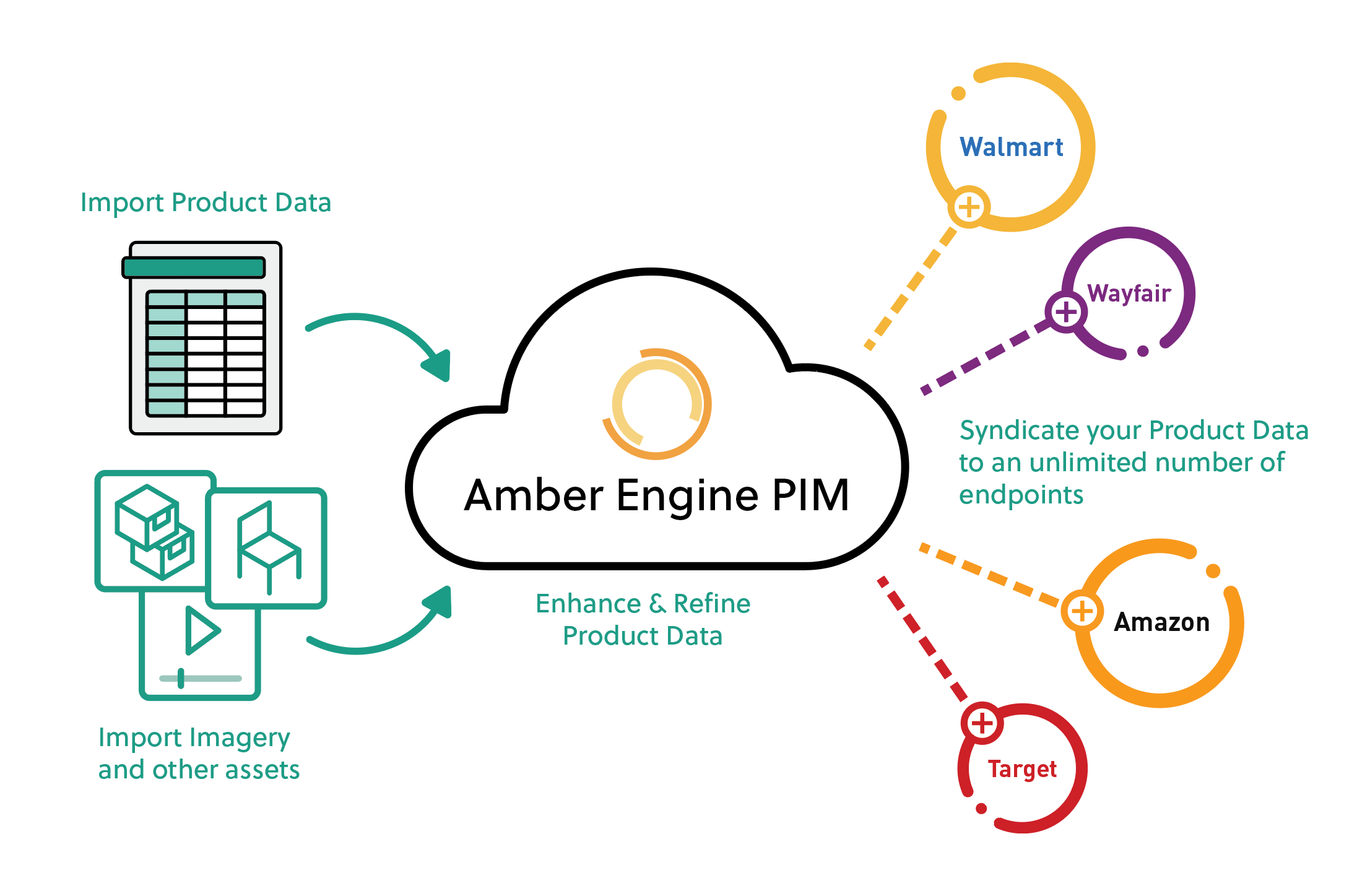
PIMs solve this by keeping a “golden record” of product data that lives in the cloud. So instead of creating a new “Labor Day Sales” sheet, you simply create a new “Labor Day Pricing” attribute, make the appropriate pricing transformations, and you are done!

But even more valuable is the syndication side of a PIM.

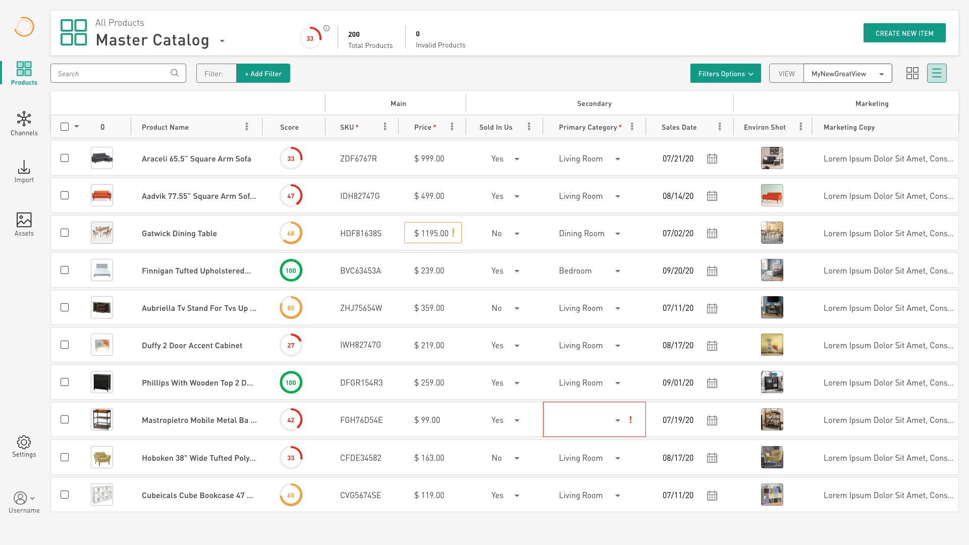
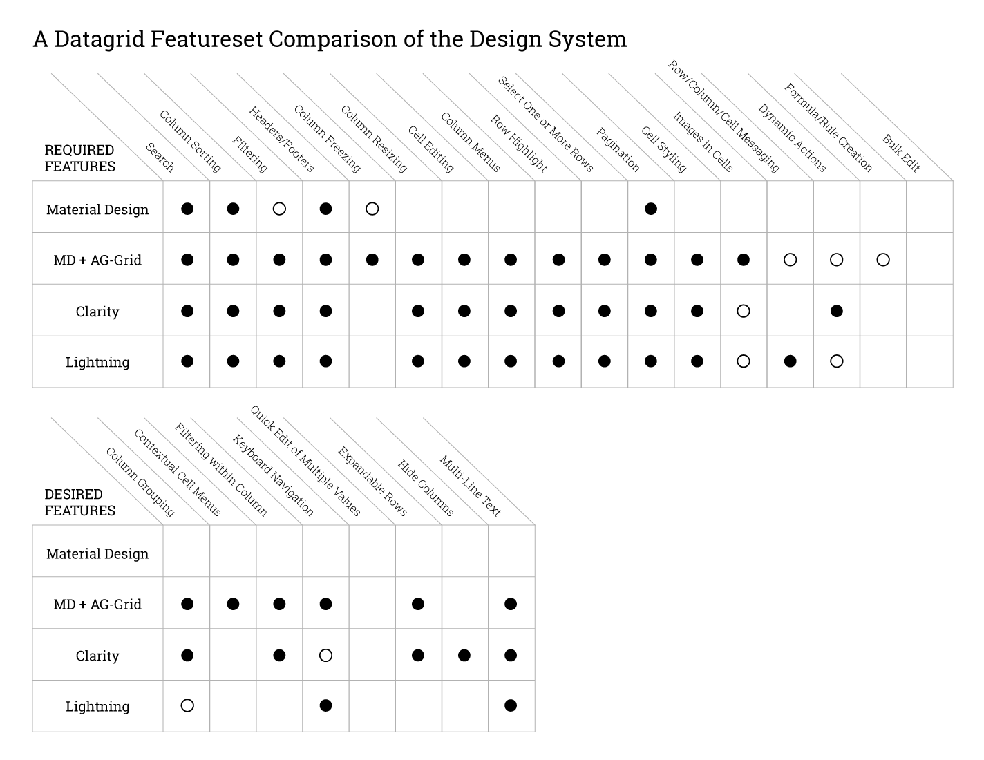
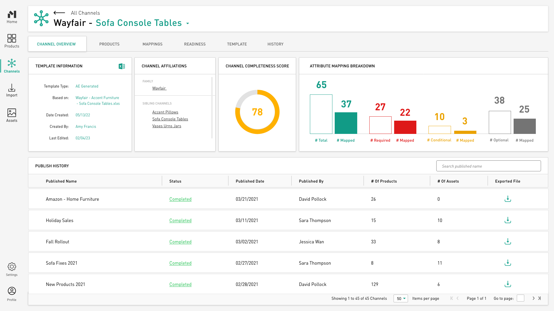
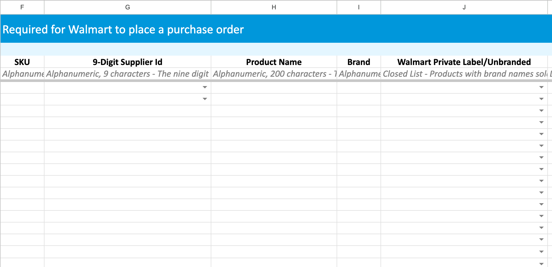
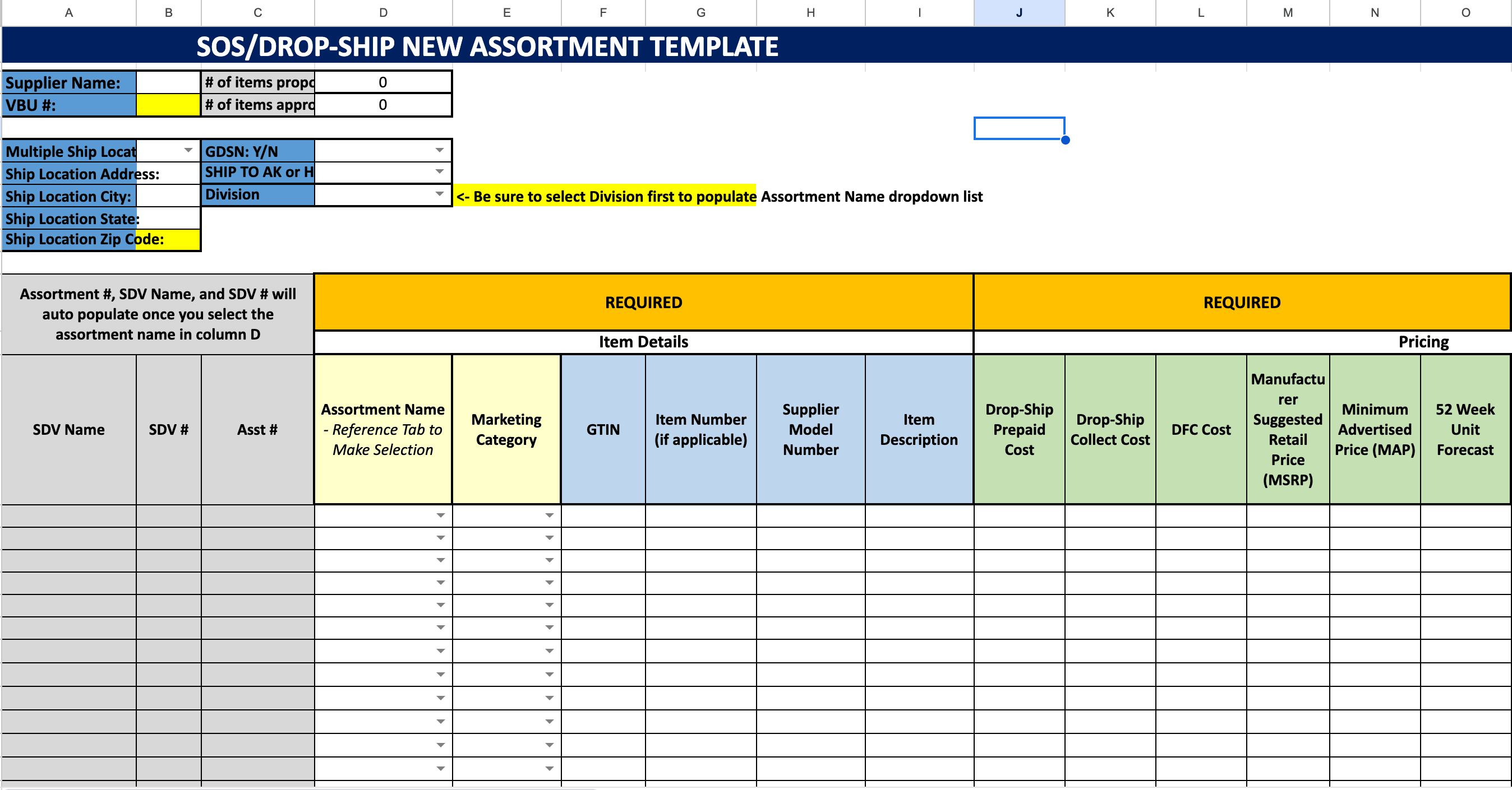
EVERY single endpoint…Walmart, Amazon, Home Depot, Kohls, Target… you name it… has a unique way of ingesting product data. They have a “template”… an Excel sheet… that they need you to fill, in order to onboard your product data.

THERE IS NO COMMON PRODUCT DATA EXCHANGE FORMAT! 

Every endpoint template is it’s own unique challenge.

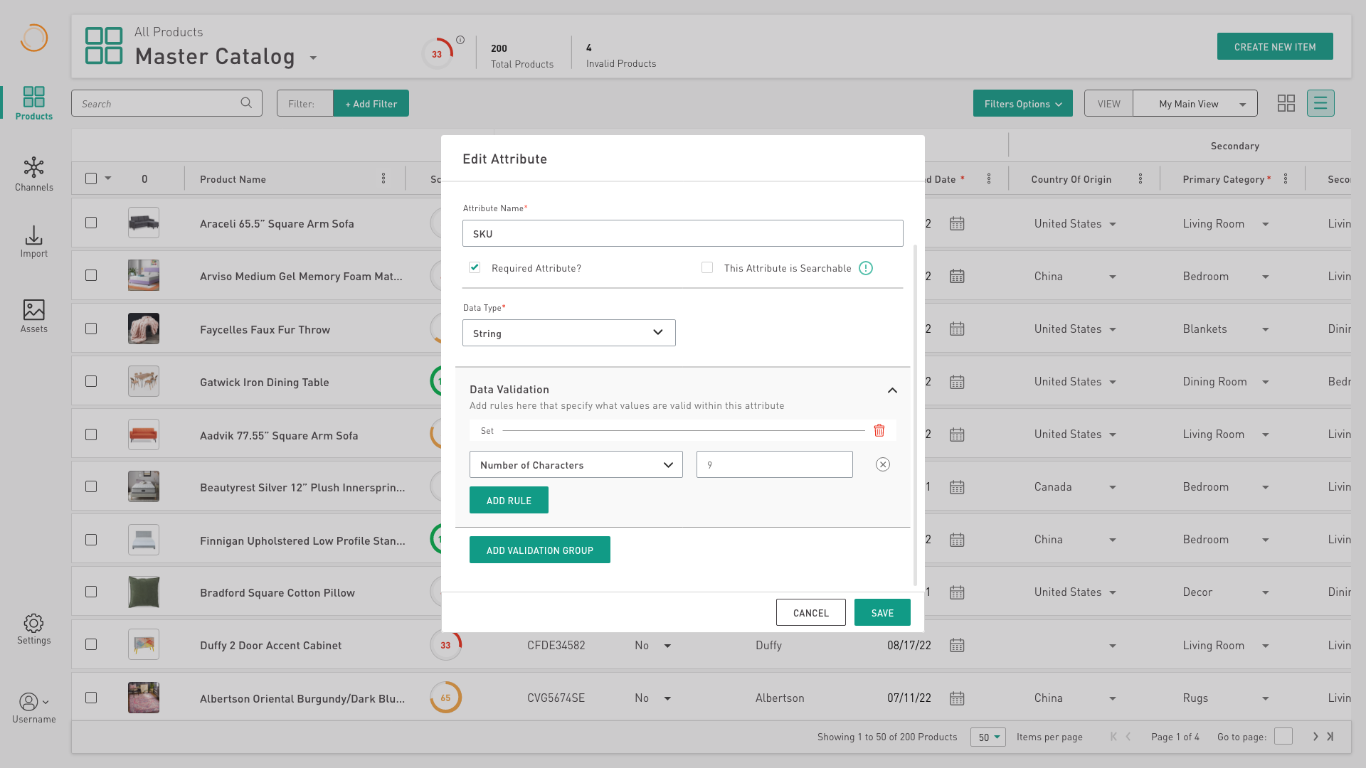
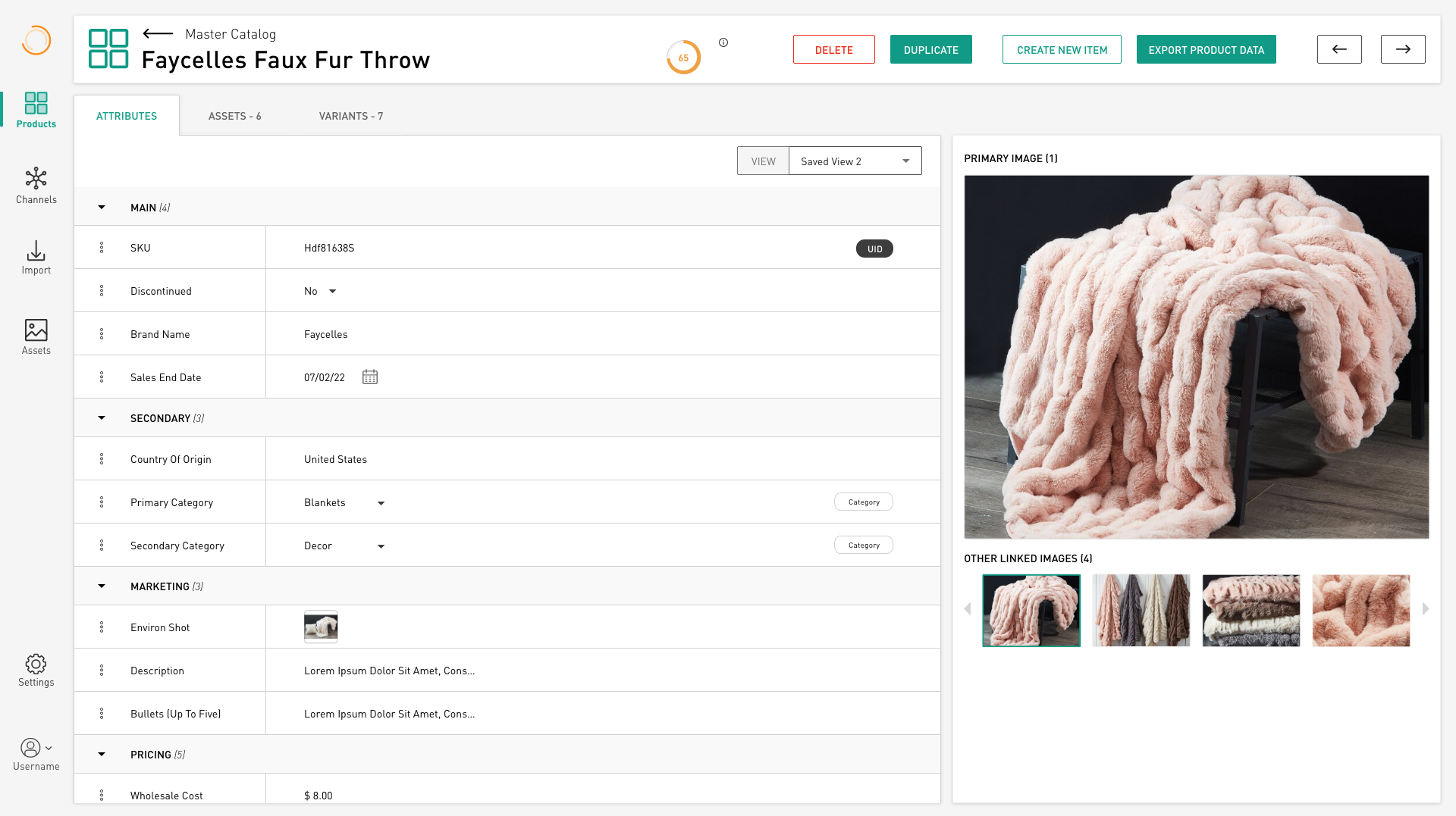
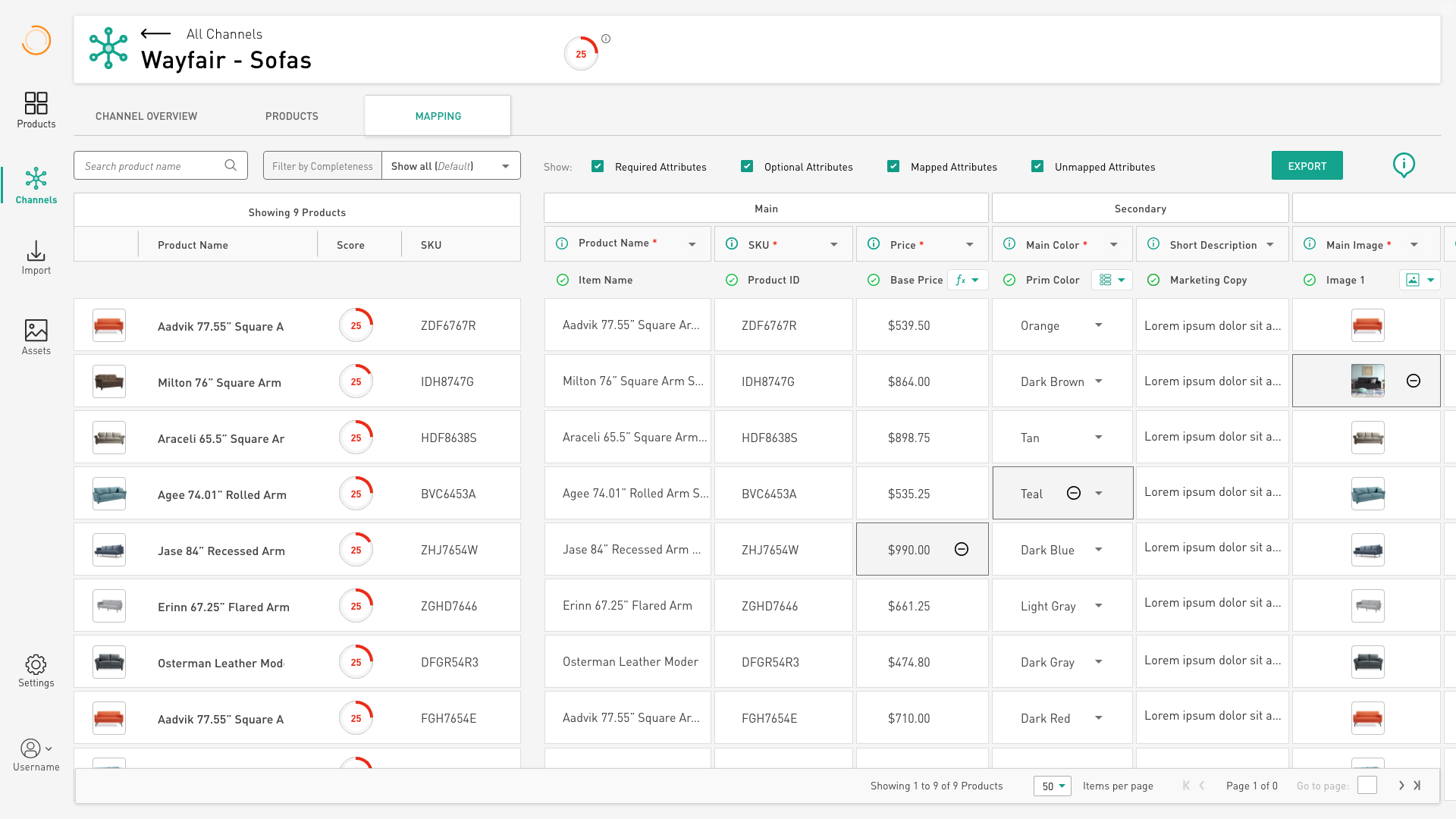
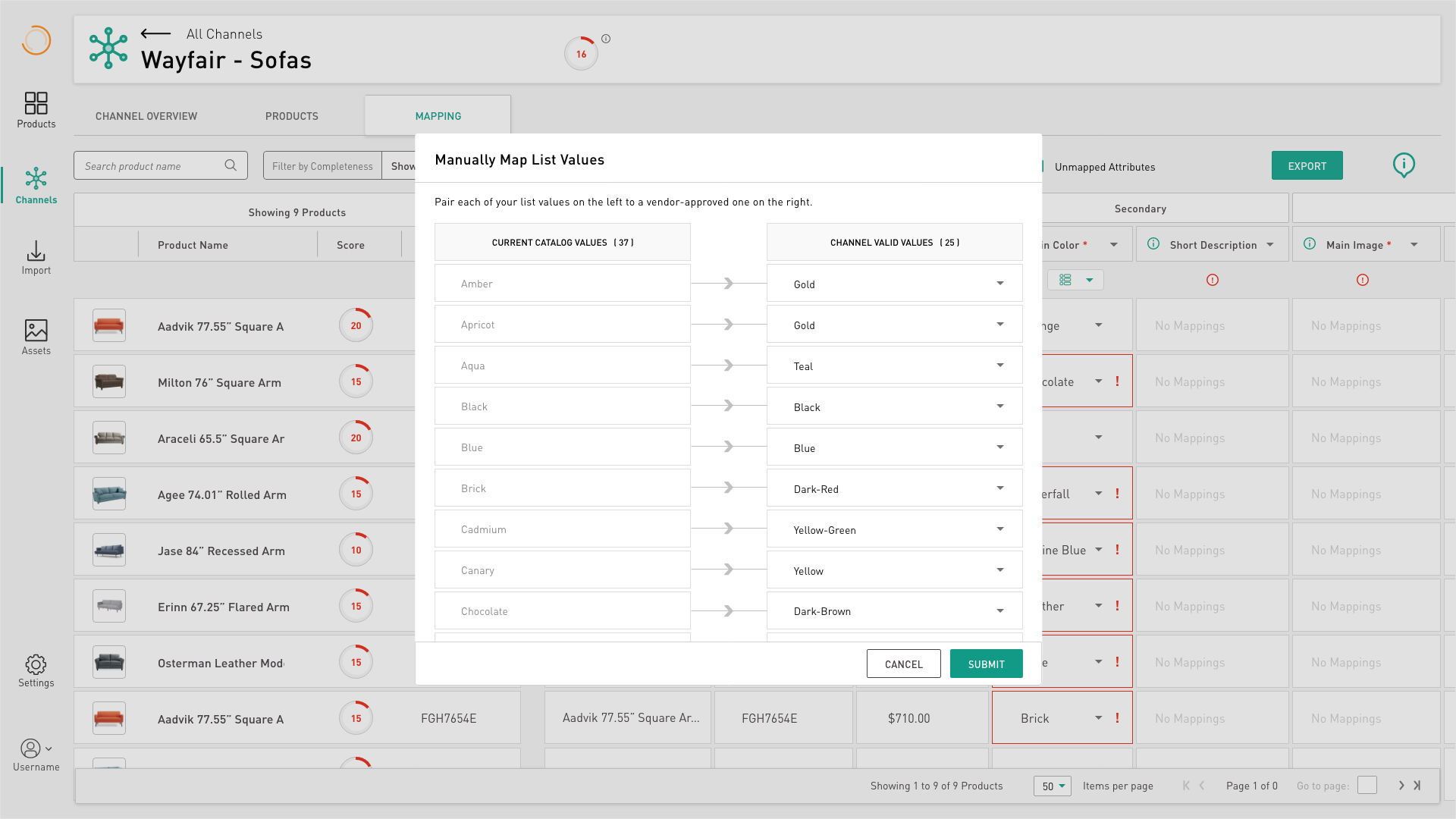
They each have a custom taxonomy of properties that they deem important. Some attributes are required, others optional. Common ones like Product Name, price, description, and dimensional data are required across all endpoints, though what they call them can be different (“Name” vs “Item Name” vs “Product Name”)

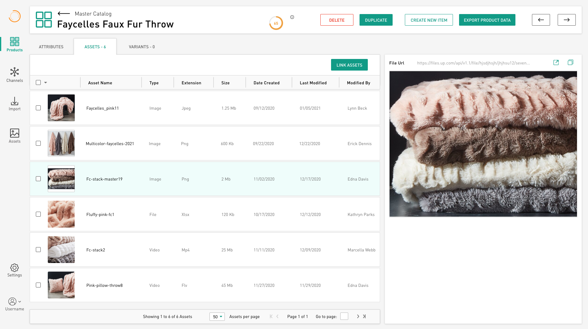
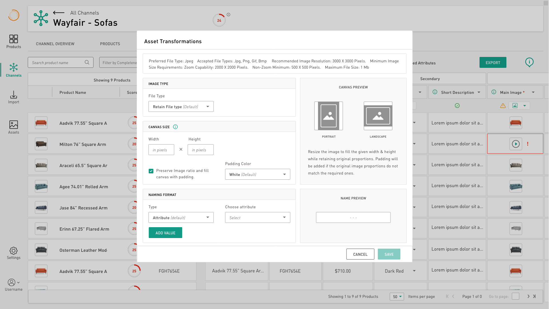
In one template, a product description shouldn’t be more than 200 words, while in another, 1000 characters is the max. Metric dimensions in Canada versus Imperial in the U.S!  Two required product images in one template versus five in another.

And maybe things need to change across markets? Price adjustments on Amazon vs Wayfair? And how do you manage MSRP and MAPP?

Now imagine how fun it is to translate your product data into each of the marketplace’s templates. Adjusting data to increase sales, manage promotions, or introduce new products means changing them on your excel sheets AND theirs!

And we haven’t even discussed when the marketplaces change THEIR OWN templates! Wayfair does this often in an effort to increase efficiencies. But it means tracking those changes, adjusting your own data, and then republishing your products.

These are the challenges that PIMs try to overcome, some better than others.

PIMs typically give a brand:

  • A unified, cloud-based source of truth for their product data

  • Methods for cleaning-up and enhancing their product data

  • A repository for associated product images, video, and other assets

  • A way to import new or updated product data

  • A syndication system to connect their data to endpoints and marketplaces

  • Lastly, the best PIMs also give their brands insights into how to change their product data to increase sales

* While these are standard components in the PIM space, most PIMs are over ten years old and are showing legacy problems.

Discovery & Design Process

My design process is flexible to accommodate different products, different teams, different origination points, and overall different circumstances. This SaaS PIM software project originated as an executive desire to create a better PIM experience, and since we didn’t have a large user group to poll, surveys and user testing weren’t in the cards. I leaned heavily on stakeholder interviews and competitive analysis during my discovery research.

Let's Start!

We had the kickoff meeting a mere 3 hours after I started on my first day, and bewilderingly we started by whiteboarding the settings section of the application. It seemed completely backwards to me, but as I got to know the existing PIM better, I realized they had designed the experience to require the user to set a bunch of preferences and data prep elements before you could import data. This was a terrible experience that I would change.

At the end of my first day, I really needed to pause and do some research.

Collecting Data on the Existing PIM Experience

After the unexpected direction the kickoff meeting took, I was able to start assessing the existing product experience, and collect user feedback stories. Initially this meant collecting anecdotal customer success stories and compiling them into a painpoint document.

Collected pain points on the existing Vesper PIM

As you may notice, this included workarounds the Customer Success people had to make to resolve these issues with our anemic first PIM.

Taking Stock of Market-Leading Competitors

Looking across the spectrum of PIMs, it was easy to identify market-leaders. Especially with Gartner Four Quadrant charts and the like.

Platforms like Salsify, Akeneo, and InRiver were feature-rich, with many more features and enablements than the six broadly-identified ones above. Many of these more advanced features like workflows, product insights, collaboration features, print and web catalogs, and metrics/reporting would become our eventual roadmap. 

For now, during Stakeholder Interviews, we identified the base features for our MVP:

  • A fast, durable, product catalog with a completely open taxonomy

  • Some level and DAM or asset manager

  • A smart Import feature that helps users track products and attributes

  • The syndication/translation system

Syndigo is the required PIM for Lowes, and there's a lot going on
InRiver is showing it's age with it's Windows-esque product tree architecture
Akeneo is pretty modern, but like most other PIMs, it's viewable taxonomy is rigid
PIMCore is just a disaster. I mean, what do I want to click on here?

Early on, I identified mistakes our competitors were making:

    • Rigid taxonomies meant the users had to conform to the software, instead of the other way around
    • Rigid taxonomies also meant that users couldn’t easily import data. They first had to translate THEIR data into the preferred format and template the other PIMs required
    • Confusing, legacy UIs confound new users
    • Proprietary, legacy terminology makes onboarding a nightmare (does a “list of products” makes sense? How about a “Content Segment of products”?)
    • Bloated Digital Asset Management (DAM) features meant new brands would often be confused with imagery onboarding
    • Syndication systems that require a Systems Integration degree to master

Let's Start Mapping Out How This Should Work

During those early MVP requirements brainstorms, we had developed a clear directive for how to develop this product. It was pretty logical:

Create Organizations, — then Users, — then Products, — then Images/Assets, — then Channels

    • Create customer Organizations
    • Get users into the system
    • Design a place for product data to exist, and then
    • Create a way to get that product data parsed and into the system
    • Design a DAM
    • Figure out how to syndicate product data

Organization & Users

Early on, I created this flow for how Orgs and Users would work.

This is only part of the flow document


This “Organization Manager” would be an internal product, so it didn’t have to experientially match the PIM.

Product Data. How does it work, and what is the experience like?

Starting with loose ideas and sketches

A brainstorming session in Miro
Playing with layout ideas

And here we are refining things. This flow document outlines how data flows in, is gated, can be modified, and moves to other places within the application

An early flowchart outlining the functionality within the Master Catalog

The Master Catalog is the heart of the system. It is where the user stores their trusted product information. It is a grid… rows of products, and columns of attributes.  This document… almost a cross between a diagram and a wireframe… captures the functionality in the Master Catalog.

An early wireframe of the MC

Taking the Concepts to Wireframes

We tried various navigation ideas, and landed on the common pattern left-side nav bar. We wanted to allow users to view products as a standard spreadsheet view, or alternately as a more visual card view.

Standard List view, ala Excel
The more visually-intensive Card View

Once we had a collection of concepts drawn out, it was time to get more granular. The Product Director wrote a series of very granular user stories, to which I paired wireframes. Each user story contained anywhere from one to 20 screens, on average.

Sample User Stories
And then the corresponding Wireframes associated with the stories

Fully Mocked-up screens for the Amber Engine PIM

The Master Catalog

The Master Catalog is the heart of the application. Here you can view all your products (rows) and all their attributes (columns). Each product is given a score based on how complete it is. Completeness is based on what percentage of required attributes are filled-in and valid. The user can filter down to subsets of products, see lists of products, or see views of attributes. It is a very flexible system, based on Excel.  

Why does it look like Excel?
Since all of our current and future customers would already be managing their product data in Excel, we wanted to leverage this affordance and make the experience familiar. This was represented mainly by the familiar spreadsheet grid and open taxonomy, but also included bulk editing using a formula builder that uses much of the common Excel library.

Performing a familiar excel formula
Setting data validation on this attribute: SKUs must be exactly 9 characters (otherwise a field is invalid, and score decreases)
A sliding task panel showing completed, in-progress, or pending tasks

Clicking into a product takes you to a product detail page (PDP) that gives you full visibility on the product, it’s attributes, and any assets (images, videos, etc) linked to it.

Here we can view all the current assets linked to this product.

The Master Style Guide

I designed this interactive style guide as a portal that everyone on the team could access and refer to. It was a semi-living document, revised and updated every couple years as the brand evolved, and as functionality was added. These are only a few samples of the much larger guide.

Why wasn’t a design system used?
I advocated for one of a couple design systems to be used, preferably either the Clarity Design System, or Salesforce’s own Lightning Design System (which I had used at my previous position). I created a full deck, arguing the merits of each system, and even alternatives like grid components to get up to speed faster.

At the time I was still just a UX Consultant, and I was overruled by certain stakeholders. When I became Director of Design, I had plans to institute Lightning down the road, possible on the v2 rollout.

chart comparing design systems

The Dashboard

We had always wanted to design a full-fledged, configurable Dashboard experience for the front of our application. It was far down on our roadmap, but when faced with the impending onboarding of hundreds of new-to-PIM Material Bank brands in 2022, I designed a fairly utilitarian version that gave users quick shortcuts to essential functionality.

An impending brand alignment allowed me to experiment with new treatments.

The Digital Asset Catalog (DAC)

The DAC is effectively the master catalog, but for imagery and assets instead of products. This is where a brand can import assets, tag & edit them, link them to products, and organize them into familiar lists.

Channels (the magic sauce)

“Channels” is the syndication part of the process. This is where you take your data and translate it according to an endpoint’s requirements. Each endpoint or marketplace, be it Amazon, Walmart, Home Depot, Overstock, Target, Kroger…wherever you want to sell your products…has a specific data format requirement. If you are an approved seller on their site, they will provide you with a custom Excel template for you to populate. These templates can be daunting, and can change frequently. The Amber Engine team would create a Channel for a brand, based on these templates, and they would maintain them over time.

Some endpoint’s templates are easy and transparent (This is Walmart)

Others are complicated

(I won’t name them, but they are a well-known marketplace, with frequent changes to their templates, making maintenance a nightmare)

The Concept of Mapping

Translating YOUR product data into your ENDPOINT’s product data requires “data mapping”.

A simple example of data mapping is where you assign, say, your “Product Name” attribute into your endpoint’s “Item Name” attribute. This is called a direct mapping

If you need to translate something, like: base price to a marked-up price, inches to centimeters, or your list of colors to an approved list of colors, you would do a formula-mapping. A formula mapping would convert these values without affecting the originals.

And this is the reusability part of the PIM… your base data stays untouched, while your endpoints get your data the way they want it.

A Wayfair channel ready to have attributes mapped
And here are 25% of the required attributes mapped, with a few overriden vales
Here we are mapping values-to-values. In this case, it is mapping MY brand colors to the corresponding approved endpoint colors
And here we have mapped an asset (images) into this column. Because of this, we are able to set transformations for things like size, image type, and naming conventions

You can export your channel any time you would like, but it’s not guaranteed to pass the endpoint’s requirements until the channel score is 100%. This is the value of that score. 

The future of the PIM: the roadmap

While the core of our next-gen PIM was the Product Catalog, DAC, and Channels:

(Product data is: [Imported] + [Cleaned, Modified] + [Matched with Imagery] + [Output to Endpoint])

We nonetheless had many features on our roadmap. Some were customer-requested, others were to keep up feature-parity with competitors, and still others were general UX improvements. With things like:

  • Print & Web Catalogs
  • Auditing and Reporting
  • Product Relationships 
  • Support Tables
  • And a configurable Dashboard

We had years of feature design to come.


A custom one-sheet, created in the Print Catalog Builder