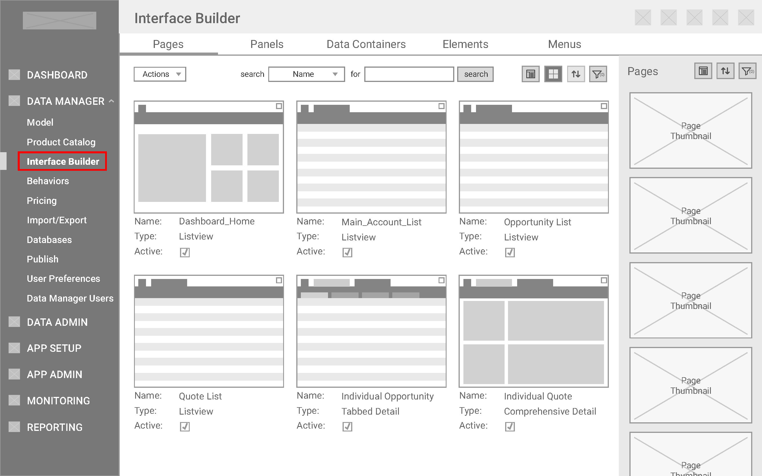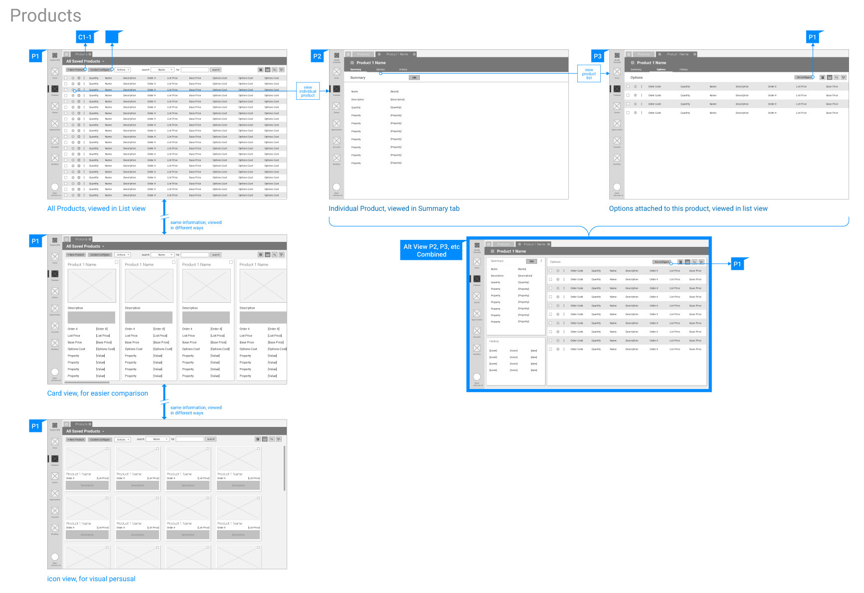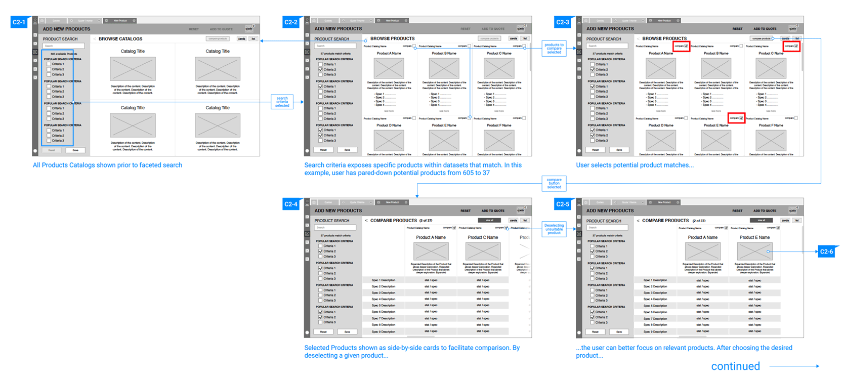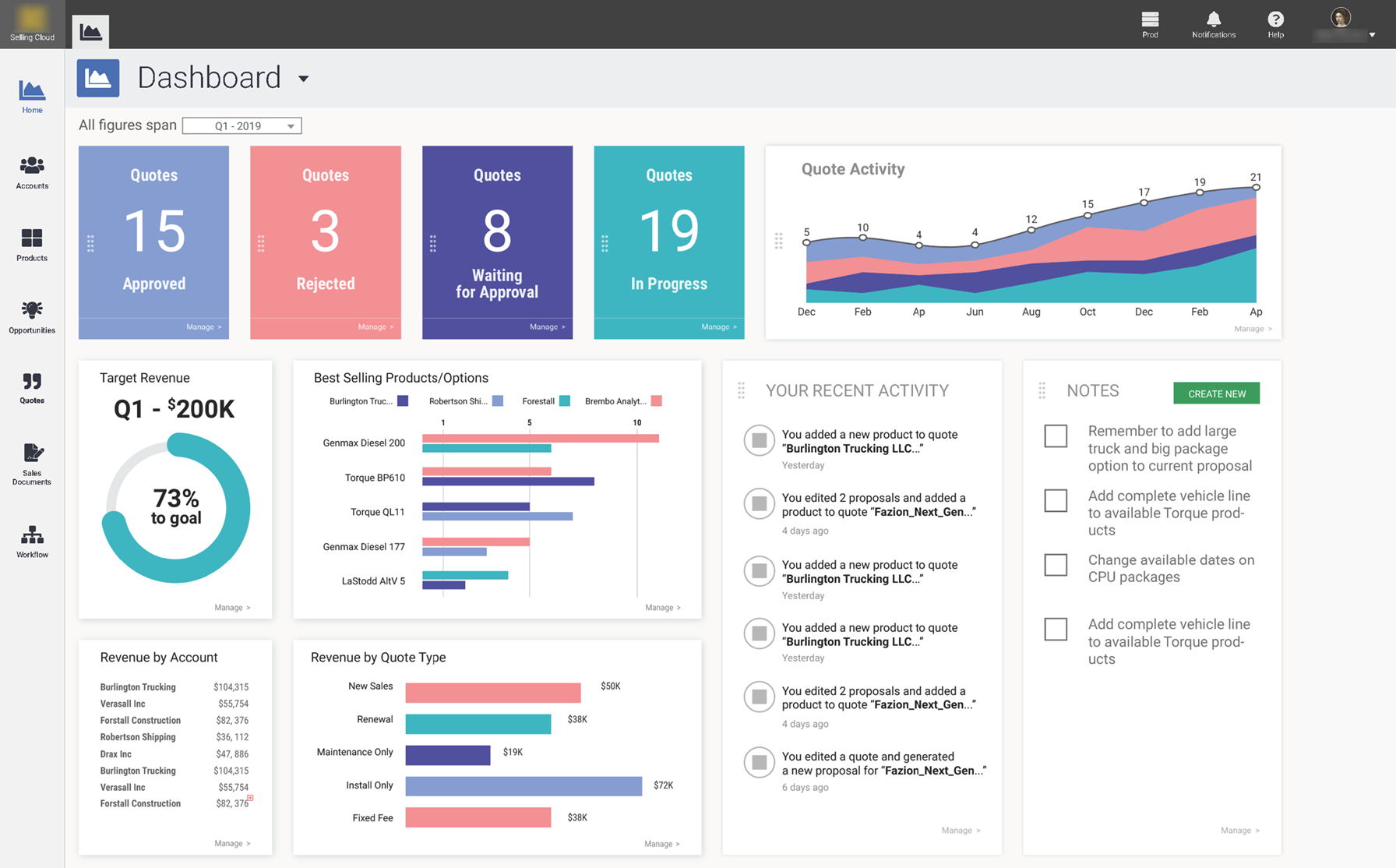
Overview
Brought in to revamp their aging software
Problem
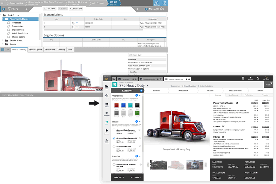
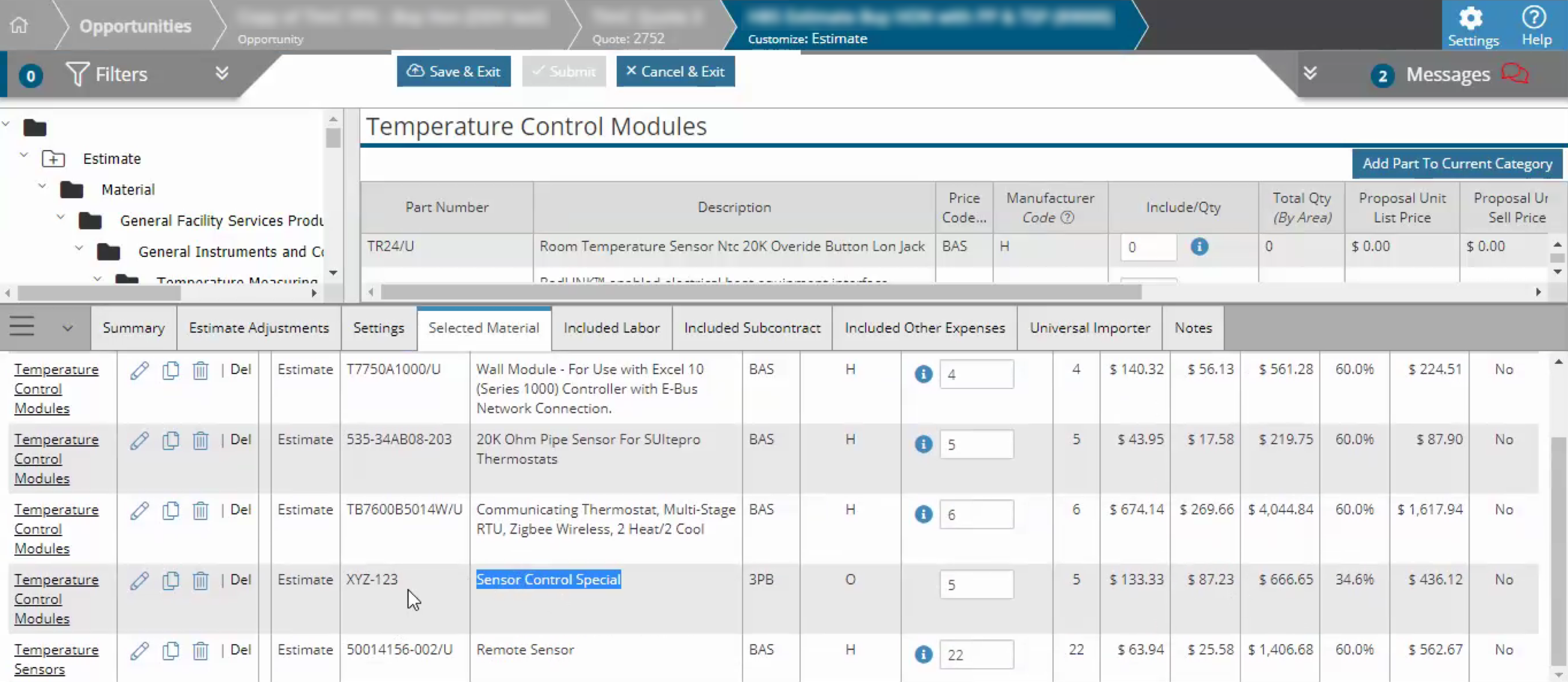
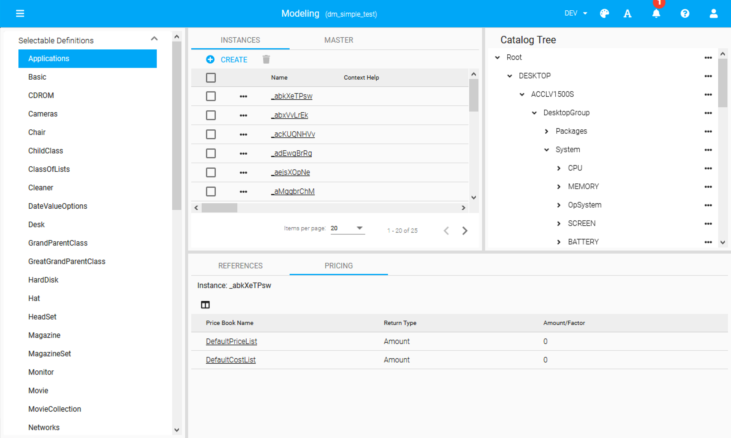
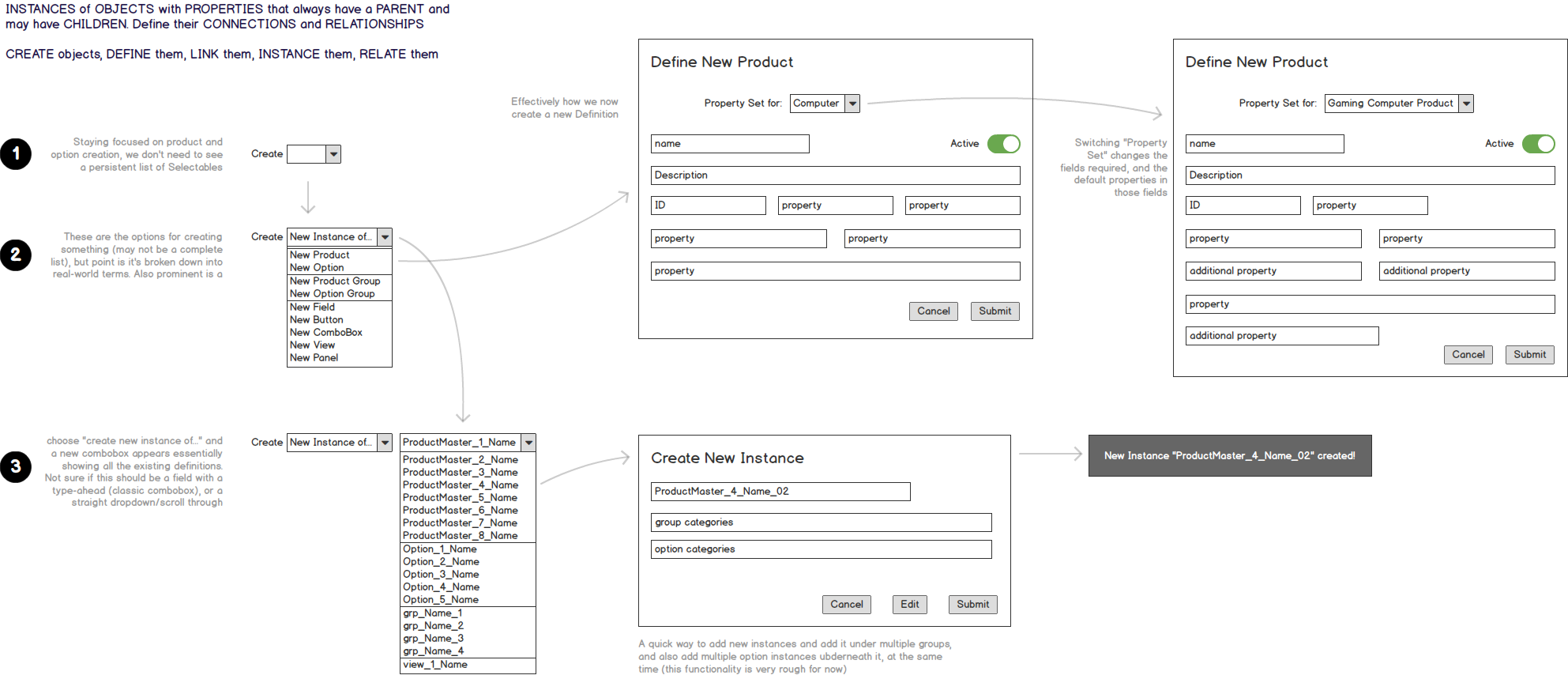
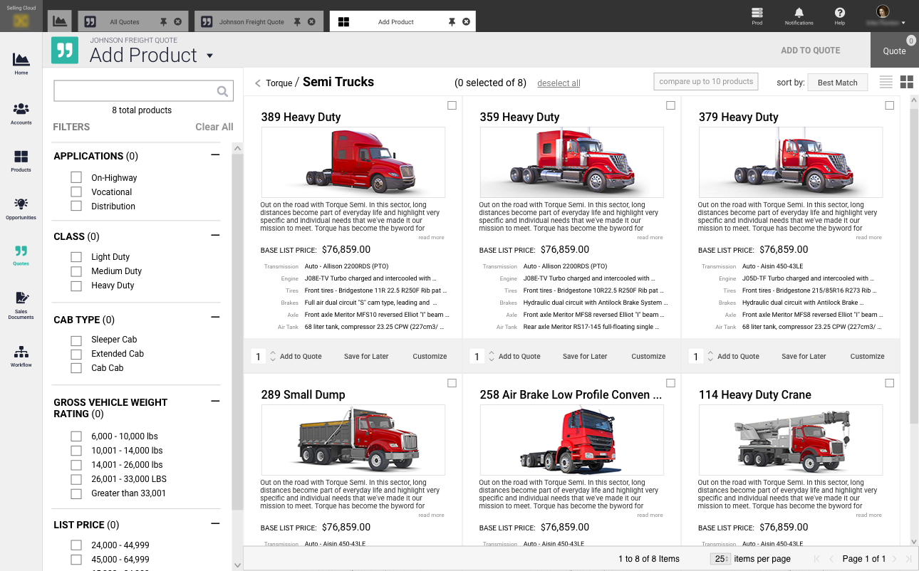
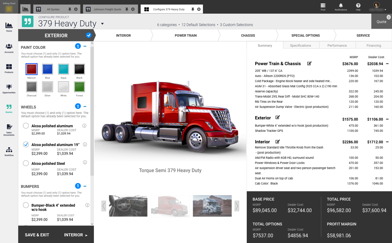
FPX was a CPQ market leader for decades, but their software was showing it’s age, and they were now competing with Salesforce.
Target
Compete with Salesforce
Team
- Head of Software
- UX Design Consultant (Me)
- Developers
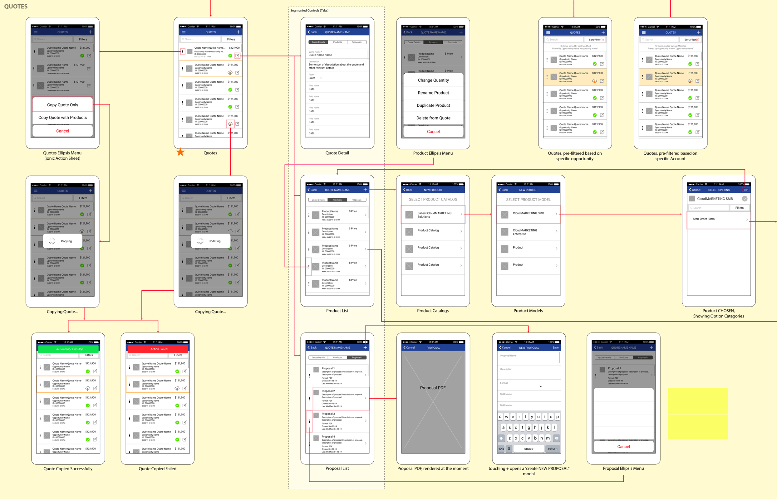
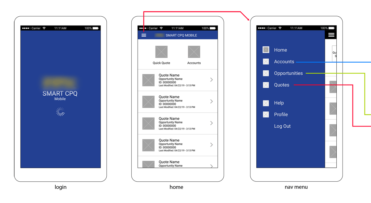
My Role
I was the singular UX Designer within this company.